Sub Busters
Taking an idea from conception to a built out responsive website.
Overview
Details
Project
Responsive Website DevelopmentRole
UX DesignerMethodologies
Topic Mapping
Screener Surveys
Journey Mapping
MoSCow & Feature Prioritization Matrix
Minimum Viable Product
Design Studio
Figma software
Zeplin softwareTeam
UX:
Zevy Block
Jessica Chiu
Liam Robb O’Hagan
SEI:
Kelly Appiah
Thomas Miller
Nora Tulchina
The goal of this project was to develop a responsive website from idea through to handoff to the a team of Developers, in this case fellow students in the Software Engineering Immersive, and to work with them to bring the idea into production. The primary focus was on the front-end development and having a user create, update and delete an account was a required feature.
We were given the area of Finance.
We started by topic mapping, which involved thinking of as many financial categories as we could and mapping each out in finer detail until we found an issue we thought we could solve. Our topic map covered everything from mortgages to micro finance, but we settled on the subject of subscriptions.
We hypothesised that people had trouble managing subscriptions and were prone to being charged for services they no longer used, especially online. We each had a story about a free trial that ended and morphed into a paid account or discovering that we had forgotten to cancel something.
How might we help people better manage their digital subscriptions and avoid wasting money on services they don’t use?
Discover
As with all things in User Experience we had to test our assumptions. In this case we wanted to interview people. To find the interviewees we developed a screener survey which we put out to our networks and the General Assembly student body. Of the 17 survey responses six agreed to be interviewed.
Screener Survey
To Screen in, participants had to be:
Over the age of 18
Used digital subscriptions
Were willing to be interviewed
Six of 17 respondents qualified leading to 5 interviews
Interviews
All five interviewees were technologically savvy and aged between 23 and 33. All of them had a story about a subscription that had got away from them. We wrote the observations and quotes from each interview on virtual sticky notes in a program called Miro and grouped them into common themes by the process of affinity mapping.
“I assume they're not going to say like, ‘Hey, you haven't used this in four months. Are you sure you want to still keep giving us money?’ ”
Peter the Elder
Define
After we completed the affinity mapping we were able to draw the following insights from the responses and the create a persona who represented the needs, goals and pain points of our average user.
Insights
Our initial assumptions were validated and we distilled the following key insight from our research.
Persona
Jaime might be a fictitious amalgam of the people we interviewed, but he helped us as designers remember our insights relate to problems real people have in the real world.
Journey Map
A journey map follows the user Persona through a process. In our case it was the discovery and cancellation of a rogue subscription. One of the key elements is to track the emotional state of the user. This can elucidate pain points and opportunities to develop a solution.
In Jamie’s journey the pain points and corresponding opportunites were
the discovery of a re-occuring charge on his bank statement,
the hassle of determining what that charge was for, (have an alternative way to track subscriptions)
the difficulty in search for the account details (alternative to email)
the time spent cancelling the account (provide information)
Design
The Journey map moved us towards the Design Phase of the project. To kick this off we invited our colleagues in the Software Engineering Immersive to join us in brainstorming ideas.
This involved a return to the virtual Miro wall where everyone put possible features of the product on sticky notes and arranged them on a MoSCoW chart.
MoSCoW Map
Our team ranked the features of the new site in terms of what must, should, could and won’t be achieved in the first build.
After the MoSCoW has sorted the possible features of a site the Must haves and Should haves are further refined using a Feature Prioritization Matrix, where the effort required to build them is plotted against the time and resources available.
The goal of all this is to come up with a Minimum Viable Product. What must be built to launch the website with regard to what is possible.
Our Minimum Viable Product included the following features
A way to create an account profile
A way to add a subscription to your profile, both automatically and manually
A way to view your subscriptions in a table or on a calendar
A way to alert the user if a subscription had not been used for a set time
Design Studio
Once we had determined the MVP we moved into a Design Studio to try and come up with some ideas as to how it would look and function.
Design Studio is a collaborative process, facilitated by the designers but one that encourages people from all across an organization to contribute. The idea is that more perspectives lead to more ideas to choose from. The other benefits are that it is fun and encourages buy in from the rest of the team.
Mid-Fidelity Prototyping
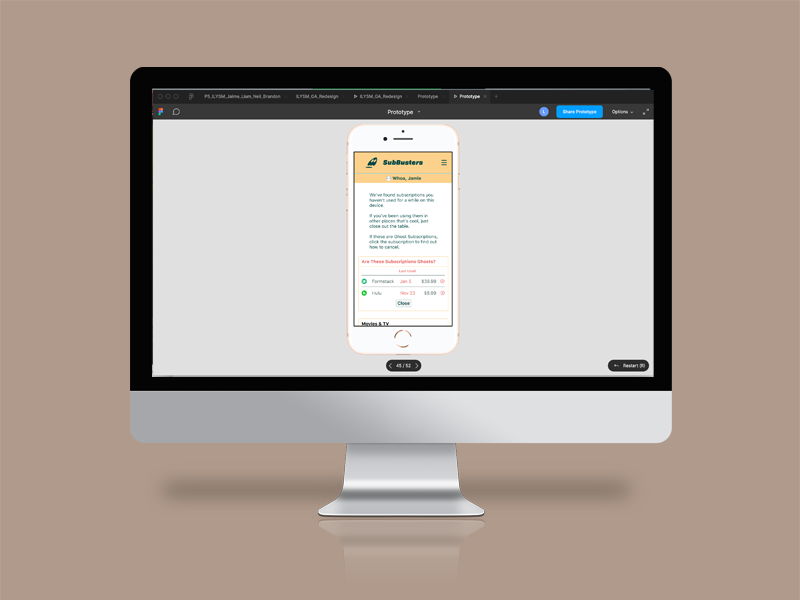
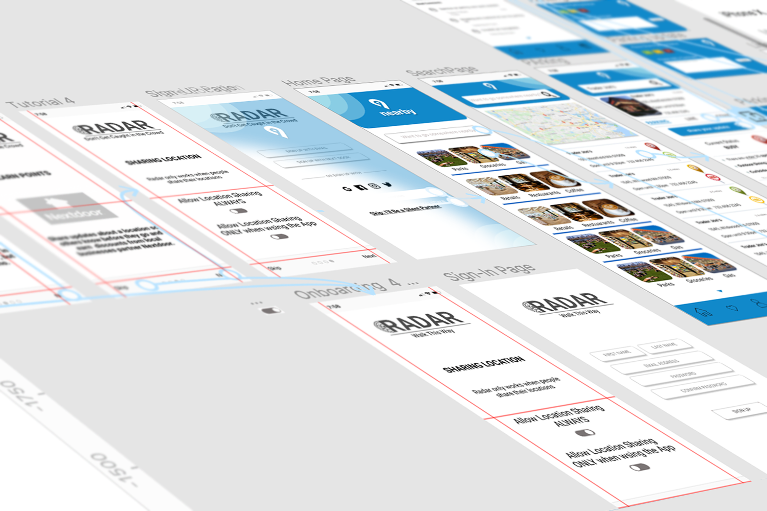
After Design Studio we worked up the ideas as a Mid-Fidelity Mobile Prototype in the design program Figma. This process put the minimum in Minimum Viable Product as we ran against the clock., which taught us a valuable lesson in estimating the time it takes to do this work. The wireframes included the following functionality.
Ability to create an account
Ability to add a subscription
Ability to find a ghost subscription
Link to information to cancel a subscription.
Link to View Prototype used in Testing
We ran five usability tests on this prototype asking the user to perform the following tasks. We recorded the users success (Direct, Indirect or Fail), time on task and evaluation of the ease of the task.
TASK Sign up for a new account, and setup your monthly Netflix subscription.
TASK Adjust your dashboard so you can see which subscription you have not accessed in a while.
TASK Find the video streaming service you are not using and cancel it.
Task 3: Wireflow
Find the video streaming service you are not using and cancel it.
Of the 15 tasks only 2 were performed indirectly, but users pointed out some minor formatting and language issues that we could incorporate into the next prototype, they also commented
The site looked gimmicky and not credible, which could have been a function of the mid-fidelity prototype and would hopefully be resolved with a high-fidelity prototype
There was some confusion over the asking for a credit card account nickname (so the user could know what account the subscription was charged to) was actually giving over the credit card.
Users also wanted to add subscriptions without having to putting data in manually, “Do I have to manually enter my subscriptions? That would be a lot of effort to set up, what if I missed one that I had forgotten about?”
And they suggested the Ghost subscriptions should be at top of the dashboard in a separate list
The prototype was not clear the user had to cancel the subscription on the provider’s website,“How do I know for real if it actually cancelled the subscription?
A Crucial Crit
We presented out findings at a Crit with our instructors.
They suggested the next prototype should actually display the iPhone keypad to mimic the action of filling in the forms to register for the site. A short cut in the original prototype meant users did not read a instruction about the credit card nickname which lead to confusion
They called into question the decision to remove the automated addition of a subscription from the Minimum Viable Product over the weekend. As the research while the feature to manually add information was necessary, the automated feature was integral to the usefulness of the site.
They also pushed back on whether it was possible to track the use of a subscription on the device by searching cookies, and told us to get a software developer’s opinion on how this could be done. We were informed we could track subscription use with a plug-in, but any use that was on another device could not be tracked and would rely on the user to confirm if they were using the service.
High-Fidelity Mobile Prototype
The next step was to develop High Fidelity Prototypes for mobile and desktop. As we had to do another round of usability testing on the mobile prototype first, we developed the look and feel of the site on mobile.
As we had changed the feature set, the tasks in the second round of usability testing were no longer analogous to the first round. We tested the flow of automatically adding subscriptions by having the user link it to a bank account so the site could search for recurring payments and display them in a dashboard. The user could then select which ones were subscriptions they wanted to track.
We also tested the downloading of the plugin, and the full cancelation flow. Again there were some things to change, and the credibility of the site was still questioned by some users.
Link to the Desktop Prototype
Deliver
Agile Development Sprint
The Trello board we used to manage the development sprint was filled with user stories that represent the features to be built.
I took the lead in producing the Zeplin file. As is the General Assembly way you learn by making mistakes and it was soon apparent that we had a few rough edges that could have been avoided with more attention to the font styles and drafting of page templates and prior to starting on the high-fidelity design.
When I was a producer at FoxSports.com from 2003–2008 Dan Strauss the Lead Developer congratulated me on producing one of the first functional specs, for the 2006 Soccer World Cup, that his developers could code without clarification. Back then I wireframed it in Word and the design was handled by the creative department who handed it off to the development team. The goal was to have such a watertight functional spec you didn’t need to be involved after the handoff. That was very much a waterfall model.
Quality Assurance
Reviewing the final website with the Software Engineering team to ensure fidelity with our design specifications.
Agile Development Cycle
Since then the world has moved to an Agile model. As designers we were charged with Project Managing the Development Cycle; a two week sprint.
We created a Trello board with User Stories to represent the features that would be built. We prioritized them according to the course requirements of our SEI collaborators, which was the to start developing a Create Read Upate and Delete a record. As it happened the subscriptions offered a way for them to do this without relying on an account registration process.
We held standups with the Development team. The what I did yesterday, what I’m doing today and my blockers formula often lead into a discussion of how to resolve an issue.
After the development work had been done and peer reviewed we held a Quality Assurance session to go over what had been built. We were told to be pixel perfect in our feedback, but it was here that we had to adjudicate the imperfections in our own design on the fly.


